eldric.substack.com
This CotD was inspired by a newly signed-up subscriber from Finland (the first that I am aware of).
The author of the CotD has combined analyses of Covid-19 and Excess Deaths (all causes) as these are related.
Panel 1 The first graph is a construct by the author as a standard CotD presentation which illustrates Covid-19 related deaths (CRDs) and vaccinations. Finland Covid-19 Related Death (CRD) rate was relatively low from the “official” declaration of the pandemic in March 2020 into the third quarter of 2021. Upon initiation of the vaccinations, the CRD rate subsided to a very low rate in mid-2021 indicating the vaccine program “appeared” to be effective with over 80 percent of the Finnish population fully vaccinated by then. The booster vaccination program started in September 2021 with almost an immediate impact on the CRD rate, increasing dramatically from about 1 per day to 57 per day on March 10, 2022 (over 50-fold increase) which is unimaginable to say the least. The vaccine-to-deaths correlation is clearly evident. It appears the Finnish Institute for Health and Welfare website (https://thl.fi/en/web/thlfi-en) contains no official statement indicating “the vaccines are safe and effective”.

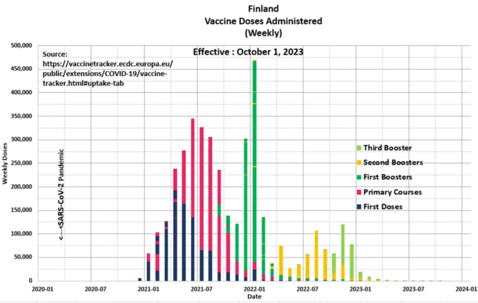
Panel 2 The graph presents the vaccinations by week as per the European Centre for Disease Prevention and Control (see link: https://vaccinetracker.ecdc.europa.eu/public/extensions/COVID-19/vaccine-tracker.html#uptake-tab).

Panel 3 Observe the characteristic cyclical nature of deaths or all-cause mortality since 2015. The “Blue” line represents data prior to March 2020 and the “Red” line represents data since the SARS CoV-2 pandemic was initiated in March 2020. The “Green” line represents the “Expected” deaths (CotD Model) based on historical averages. The author has utilized the data for the five year period January 2015 to December 2019 in order to calculate an average normalized curve for Weekly Deaths. The Expected (CotD Model) deaths incorporates an average 2.5 percent growth factor which may be somewhat conservative, however, this approach appears to be a good match to the overall trend.

Panel 4 This presents the magnified portion (January 2020 to October 2023) of the graph in Panel 2. The “Orange” line represents “Excess Deaths” which is calculated by subtracting Expected Deaths from Official Deaths.

Panel 5 Based on the data and this author’s model, there have been 13,979 Excess Deaths since the start of Covid-19 injections in December 2020. This compares to 12,542 excess deaths over the same time frame as per the https://ourworldindata.org/grapher/cumulative-excess-deaths-covid?country=~FIN website. Again, note the vast majority of excess deaths have occurred since initiation of the Covid-19 booster program.

“Who asks for the road doesn’t get lost” Finnish Proverb


