

by Eldric Vero
December 3, 2023
This CotD was inspired by a recent article from Dr. Guy Hatchard “What the Whistleblower Data Tells Us About the New Zealand Ministry of Health” (see link: https://hatchardreport.com/what-the-whistleblower-data-tells-us-about-the-new-zealand-ministry-of-health/ ). From the article: “This week an interview with a Ministry of Health employee under the pseudonym Winston Smith, who leaked data to former journalist and recent political candidate Liz Gunn, caused an international sensation.”. See link to this video (https://rumble.com/v3ynskd-operation-m.o.a.r-mother-of-all-revelations.html).
The author of the CotD has combined analyses of Covid-19 and Excess Deaths (all causes) as these are related.
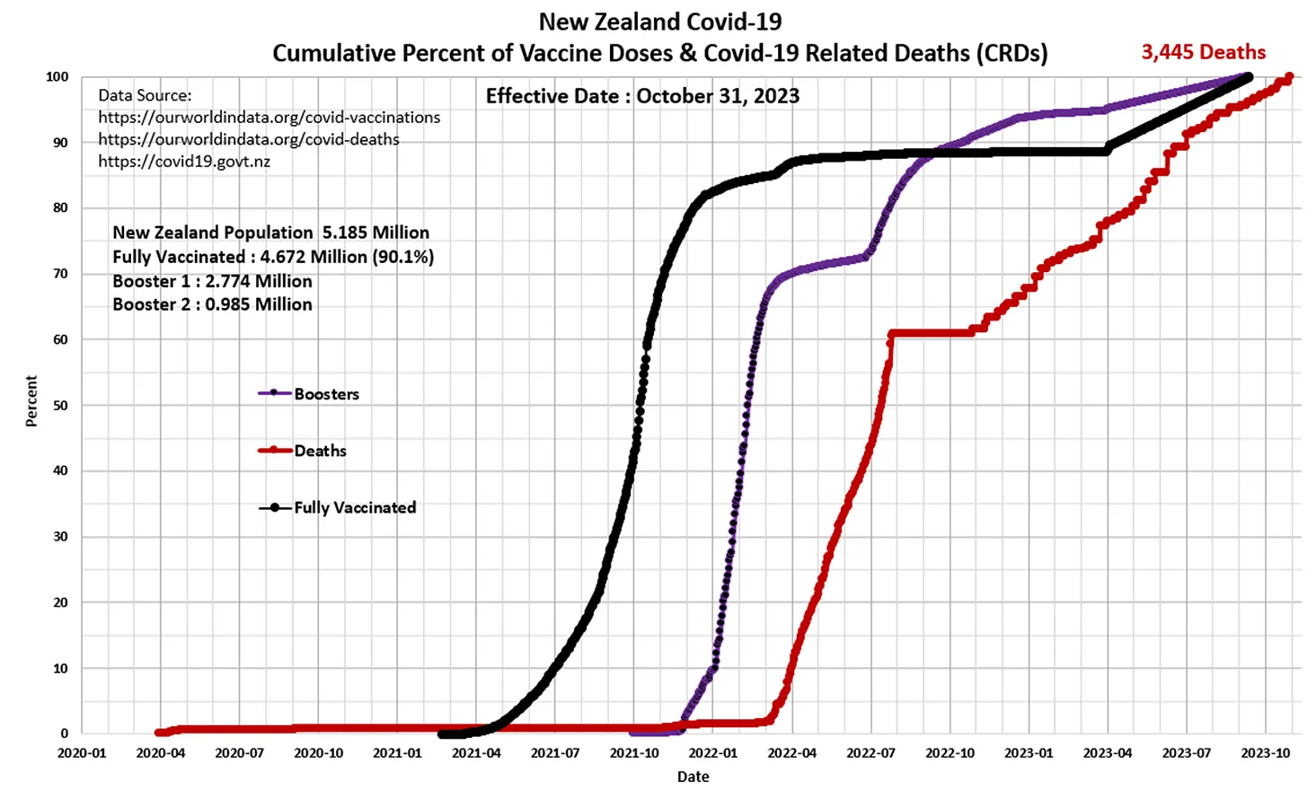
Panel 1 The first graph is a construct by the author as a standard CotD presentation which illustrates Covid-19 related deaths (CRDs) and vaccinations. New Zealand (NZL) Covid-19 Related Death (CRD) rate was essentially “zero” from August 2020 to October 2021. The vaccination program started in late February 2021 with no effect on the existing “flattened” CRD rate. Observe the meteoric rise of CRDs starting in March 2022 about 5 to 6 months after the booster vaccine program was initiated. The vaccine-to-deaths correlation of near 100 percent is clearly evident. The CRD rate peaked at 98 NZL citizens dying in one day in late July 2022, which was absolutely tragic to say the least. It appears the NZL “Unite against COVID-19” website (
https://covid19.govt.nz/) contains no official statement indicating “the vaccines are safe and effective”.
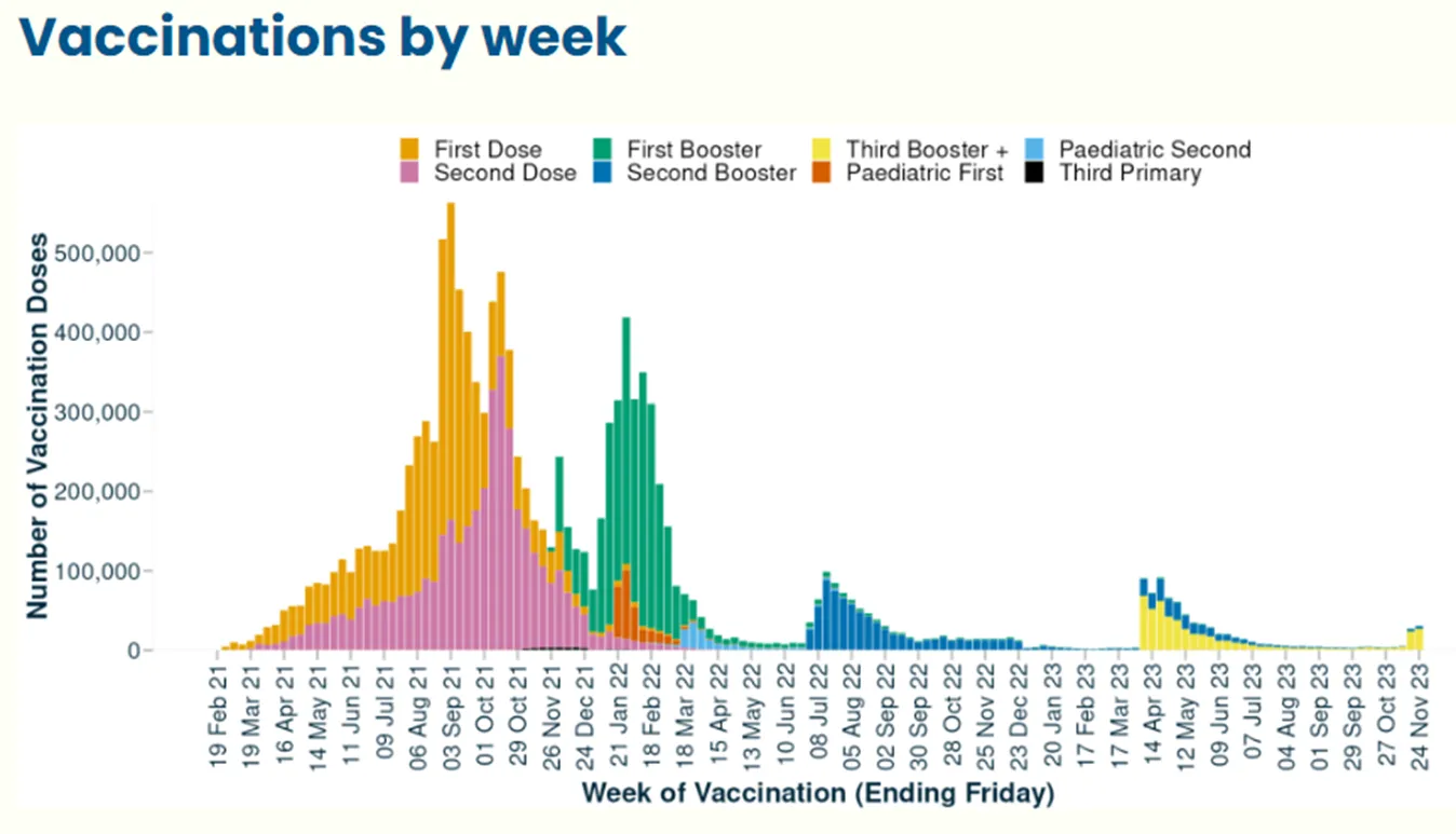
Panel 2 The graph presents the vaccinations by week as per Health New Zealand (see link: https://www.tewhatuora.govt.nz/our-health-system/data-and-statistics/covid-vaccine-data).
Panel 3 Observe the characteristic cyclical nature of deaths or all-cause mortality since 2015. The “Blue” line represents data prior to March 2020 and the “Red” line represents data since the SARS CoV-2 pandemic was initiated in March 2020. The “Green” line represents the “Expected” deaths (CotD Model) based on historical averages. The author has utilized the Japan data for the six year period January 2015 to December 2020 in order to calculate an average normalized curve for Weekly Deaths. The Expected (CotD Model) deaths incorporates an average 2.5 percent growth factor which may be somewhat conservative, however, this approach appears to be a good match to the overall trend.

Panel 4 This presents the magnified portion (January 2020 to July 2023) of the graph in Panel 2. The “Orange” line represents “Excess Deaths” which is calculated by subtracting Expected Deaths from Official Deaths.

Panel 5 Based on the data and this author’s model, there have been 8,621 Excess Deaths since the start of Covid-19 injections in February 2021. This compares to 30 excess deaths (that is not a typo) over the same time frame as per the https://ourworldindata.org/grapher/cumulative-excess-deaths-covid?country=~NZL website. The citizens of New Zealand know something is not right – a full investigation is required.


